

How to build a bottom navigation component with Tailwind CSS and Flowbite


In this tutorial, you will learn how to build a bottom navigation UI component using the utility classes from Tailwind CSS and the design system from Flowbite.
A bottom navigation component can be used as a navigational menu, CTA actions, and control buttons positioned at the bottom of the page as you scroll down.
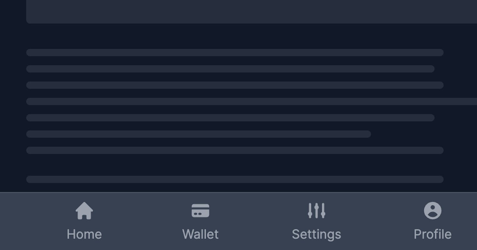
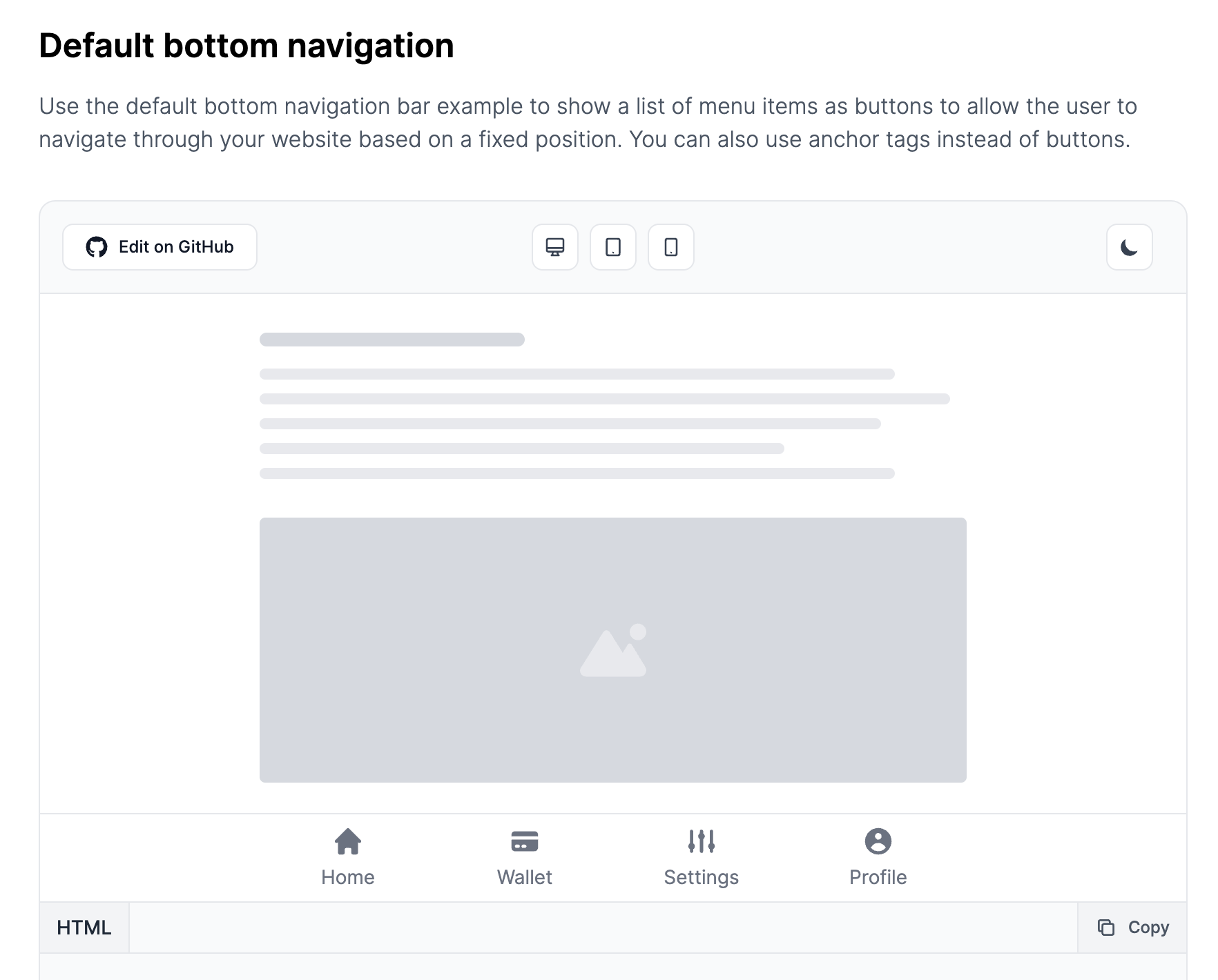
The component that we will build will be responsive and also support dark mode and here's how it will look in the end:
Without further ado, let's get started!
Tailwind CSS Bottom Navigation
The first thing we need to do is to set up the basic HTML structure using a <div> wrapper and a list of <button> or <a> elements:
<div>
    <div>
        <button type="button">
            <span>Home</span>
        </button>
        <button type="button">
            <span>Wallet</span>
        </button>
        <button type="button">
            <span>Settings</span>
        </button>
        <button type="button">
            <span>Profile</span>
        </button>
    </div>
</div>
Proceeding with the next steps we need to position this component using the fixed utility class and set up a high Z-index so that it will go over other elements as you scroll down:
<div class="fixed bottom-0 left-0 z-50 w-full h-16 bg-white border-t border-gray-200">
    <div>
        <button type="button">
            <span>Home</span>
        </button>
        <button type="button">
            <span>Wallet</span>
        </button>
        <button type="button">
            <span>Settings</span>
        </button>
        <button type="button">
            <span>Profile</span>
        </button>
    </div>
</div>
Next up, let's add a maximum width to the second div inside the component and make it fluid on mobile devices:
<div class="fixed bottom-0 left-0 z-50 w-full h-16 bg-white border-t border-gray-200">
    <div class="grid h-full max-w-lg grid-cols-4 mx-auto">
        <button type="button">
            <span>Home</span>
        </button>
        <button type="button">
            <span>Wallet</span>
        </button>
        <button type="button">
            <span>Settings</span>
        </button>
        <button type="button">
            <span>Profile</span>
        </button>
    </div>
</div>
Let's now style one of the buttons and also add a SVG icon and make sure that you also use the aria-hidden="true" tag for accessibility:
<button type="button" class="inline-flex flex-col items-center justify-center px-5 hover:bg-gray-50 group">
            <svg class="w-6 h-6 mb-1 text-gray-500 group-hover:text-blue-600" fill="currentColor" viewBox="0 0 20 20" xmlns="http://www.w3.org/2000/svg" aria-hidden="true">
                <path d="M10.707 2.293a1 1 0 00-1.414 0l-7 7a1 1 0 001.414 1.414L4 10.414V17a1 1 0 001 1h2a1 1 0 001-1v-2a1 1 0 011-1h2a1 1 0 011 1v2a1 1 0 001 1h2a1 1 0 001-1v-6.586l.293.293a1 1 0 001.414-1.414l-7-7z"></path>
            </svg>
            <span class="text-sm text-gray-500 group-hover:text-blue-600">Home</span>
</button>
Awesome! Now let's add three more buttons and apply the dark mode classes as well:
<div class="fixed bottom-0 left-0 z-50 w-full h-16 bg-white border-t border-gray-200 dark:bg-gray-700 dark:border-gray-600">
    <div class="grid h-full max-w-lg grid-cols-4 mx-auto">
        <button type="button" class="inline-flex flex-col items-center justify-center px-5 hover:bg-gray-50 dark:hover:bg-gray-800 group">
            <svg class="w-6 h-6 mb-1 text-gray-500 dark:text-gray-400 group-hover:text-blue-600 dark:group-hover:text-blue-500" fill="currentColor" viewBox="0 0 20 20" xmlns="http://www.w3.org/2000/svg" aria-hidden="true">
                <path d="M10.707 2.293a1 1 0 00-1.414 0l-7 7a1 1 0 001.414 1.414L4 10.414V17a1 1 0 001 1h2a1 1 0 001-1v-2a1 1 0 011-1h2a1 1 0 011 1v2a1 1 0 001 1h2a1 1 0 001-1v-6.586l.293.293a1 1 0 001.414-1.414l-7-7z"></path>
            </svg>
            <span class="text-sm text-gray-500 dark:text-gray-400 group-hover:text-blue-600 dark:group-hover:text-blue-500">Home</span>
        </button>
        <button type="button" class="inline-flex flex-col items-center justify-center px-5 hover:bg-gray-50 dark:hover:bg-gray-800 group">
            <svg class="w-6 h-6 mb-1 text-gray-500 dark:text-gray-400 group-hover:text-blue-600 dark:group-hover:text-blue-500" fill="currentColor" viewBox="0 0 20 20" xmlns="http://www.w3.org/2000/svg" aria-hidden="true">
                <path d="M4 4a2 2 0 00-2 2v1h16V6a2 2 0 00-2-2H4z"></path>
                <path clip-rule="evenodd" fill-rule="evenodd" d="M18 9H2v5a2 2 0 002 2h12a2 2 0 002-2V9zM4 13a1 1 0 011-1h1a1 1 0 110 2H5a1 1 0 01-1-1zm5-1a1 1 0 100 2h1a1 1 0 100-2H9z"></path>
            </svg>
            <span class="text-sm text-gray-500 dark:text-gray-400 group-hover:text-blue-600 dark:group-hover:text-blue-500">Wallet</span>
        </button>
        <button type="button" class="inline-flex flex-col items-center justify-center px-5 hover:bg-gray-50 dark:hover:bg-gray-800 group">
            <svg class="w-6 h-6 mb-1 text-gray-500 dark:text-gray-400 group-hover:text-blue-600 dark:group-hover:text-blue-500" fill="currentColor" viewBox="0 0 20 20" xmlns="http://www.w3.org/2000/svg" aria-hidden="true">
                <path d="M5 4a1 1 0 00-2 0v7.268a2 2 0 000 3.464V16a1 1 0 102 0v-1.268a2 2 0 000-3.464V4zM11 4a1 1 0 10-2 0v1.268a2 2 0 000 3.464V16a1 1 0 102 0V8.732a2 2 0 000-3.464V4zM16 3a1 1 0 011 1v7.268a2 2 0 010 3.464V16a1 1 0 11-2 0v-1.268a2 2 0 010-3.464V4a1 1 0 011-1z"></path>
            </svg>
            <span class="text-sm text-gray-500 dark:text-gray-400 group-hover:text-blue-600 dark:group-hover:text-blue-500">Settings</span>
        </button>
        <button type="button" class="inline-flex flex-col items-center justify-center px-5 hover:bg-gray-50 dark:hover:bg-gray-800 group">
            <svg class="w-6 h-6 mb-1 text-gray-500 dark:text-gray-400 group-hover:text-blue-600 dark:group-hover:text-blue-500" fill="currentColor" viewBox="0 0 20 20" xmlns="http://www.w3.org/2000/svg" aria-hidden="true">
                <path clip-rule="evenodd" fill-rule="evenodd" d="M18 10a8 8 0 11-16 0 8 8 0 0116 0zm-6-3a2 2 0 11-4 0 2 2 0 014 0zm-2 4a5 5 0 00-4.546 2.916A5.986 5.986 0 0010 16a5.986 5.986 0 004.546-2.084A5 5 0 0010 11z"></path>
            </svg>
            <span class="text-sm text-gray-500 dark:text-gray-400 group-hover:text-blue-600 dark:group-hover:text-blue-500">Profile</span>
        </button>
    </div>
</div>
This is the final code that you need to replicate the preview from the beginning of the article, and if you use the dark mode settings from Tailwind CSS then the inverse colors will be activated:

This component is part of a larger collection of free and open-source Tailwind CSS Bottom Navigation components from the Flowbite Library.
Video presentation
You can also check out this video on Twitter presenting the whole collection of the bottom navigation UI components from Flowbite.
Credits
This tutorial couldn't have been built without the awesome open-source libraries and resources: