A hero component is one of the most important parts of a website because it is the first section to appear "above the fold" and you can increase the change for the website visitor not to leave your page.
It usually holds at least a CTA button, a heading, a description, and a visual.
Today I will show you how you can build a simple hero component with a heading, description, button, and visual using Tailwind CSS and Flowbite.
Tailwind CSS is the most widely used utility-first CSS framework that helps you speed up website development without ever needing to leave your HTML.
Flowbite is the most popular and open source component library built on top of the Tailwind CSS framework featuring navbars, modals, dropdowns, and more.
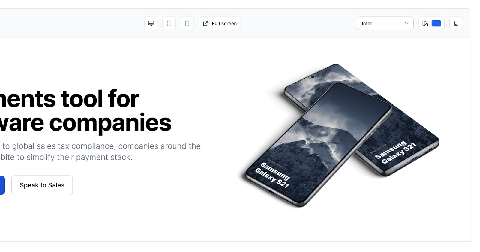
Here's a preview of the hero section that we'll build:
Let's get started!
Building a hero component with Tailwind CSS
First things first we need to use a <section> element and use at least one <h1> tag for the whole page.
<section>
    <h1>Payments tool for software companies</h1>
</section>
Awesome! Now let's wrap up some <divs> tags to be able to create two rows and also add a <p> tag with description and two <a> CTA buttons:
<section>
    <div>
        <div>
            <h1>Payments tool for software companies</h1>
            <p>From checkout to global sales tax compliance, companies around the world use Flowbite to simplify their payment stack.</p>
            <a href="#">
                Get started
            </a>
            <a href="#">
                Speak to Sales
            </a>
        </div>
    </div>
</section>
Great! Now let's also add an image:
<section>
    <div>
        <div>
            <h1>Payments tool for software companies</h1>
            <p>From checkout to global sales tax compliance, companies around the world use Flowbite to simplify their payment stack.</p>
            <a href="#">
                Get started
            </a>
            <a href="#">
                Speak to Sales
            </a>
        </div>
    <div>
            <img src="https://flowbite.s3.amazonaws.com/blocks/marketing-ui/hero/phone-mockup.png" alt="mockup">
        </div>
    </div>
</section>
Now that we have all of the necessary tags for it to be semantically correct we still need to style them.
Let's use the styling from the second Tailwind CSS Hero section from the Flowbite Blocks collection and apply the utility classes from there:
<section class="bg-white dark:bg-gray-900">
    <div class="grid max-w-screen-xl px-4 py-8 mx-auto lg:gap-8 xl:gap-0 lg:py-16 lg:grid-cols-12">
        <div class="mr-auto place-self-center lg:col-span-7">
            <h1 class="max-w-2xl mb-4 text-4xl font-extrabold tracking-tight leading-none md:text-5xl xl:text-6xl dark:text-white">Payments tool for software companies</h1>
            <p class="max-w-2xl mb-6 font-light text-gray-500 lg:mb-8 md:text-lg lg:text-xl dark:text-gray-400">From checkout to global sales tax compliance, companies around the world use Flowbite to simplify their payment stack.</p>
            <a href="#" class="inline-flex items-center justify-center px-5 py-3 mr-3 text-base font-medium text-center text-white rounded-lg bg-blue-700 hover:bg-blue-800 focus:ring-4 focus:ring-blue-300 dark:focus:ring-blue-900">
                Get started
                <svg class="w-5 h-5 ml-2 -mr-1" fill="currentColor" viewBox="0 0 20 20" xmlns="http://www.w3.org/2000/svg"><path fill-rule="evenodd" d="M10.293 3.293a1 1 0 011.414 0l6 6a1 1 0 010 1.414l-6 6a1 1 0 01-1.414-1.414L14.586 11H3a1 1 0 110-2h11.586l-4.293-4.293a1 1 0 010-1.414z" clip-rule="evenodd"></path></svg>
            </a>
            <a href="#" class="inline-flex items-center justify-center px-5 py-3 text-base font-medium text-center text-gray-900 border border-gray-300 rounded-lg hover:bg-gray-100 focus:ring-4 focus:ring-gray-100 dark:text-white dark:border-gray-700 dark:hover:bg-gray-700 dark:focus:ring-gray-800">
                Speak to Sales
            </a>
        </div>
        <div class="hidden lg:mt-0 lg:col-span-5 lg:flex">
            <img src="https://flowbite.s3.amazonaws.com/blocks/marketing-ui/hero/phone-mockup.png" alt="mockup">
        </div>
    </div>
</section>
Awesome! This is the final code that is needed for the hero section to look like in the preview.
If you activate the dark mode with Tailwind CSS the hero section will look like this:
I hope that you have found this tutorial helpful in building your website with Tailwind CSS and Flowbite.
This hero section is an example from the other hero sections coded in Tailwind CSS from the Flowbite Blocks collection and based on the Flowbite Library.
🔗 Helpful links and credits:


