Hey developers!
In this article, I will show you a collection of chat bubble components built with Tailwind CSS and the Flowbite UI library. Both technologies are open-source and you'll learn how to set everything up to make the components work.
Tailwind CSS Chat Bubble
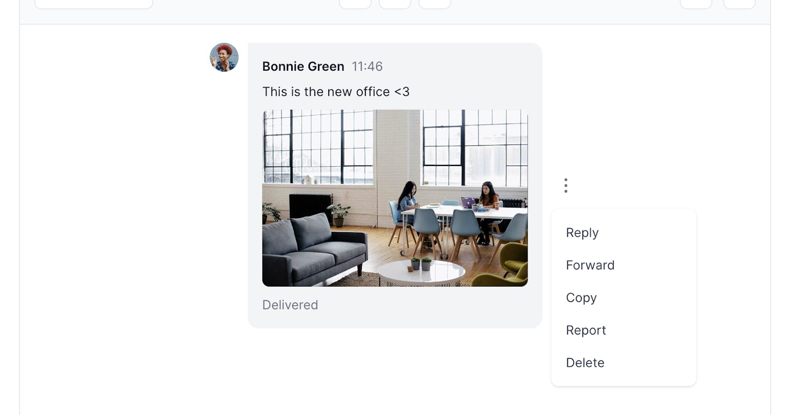
The chat bubble component is the building block for creating chat interfaces where users can send messages to each other by text, voice notes, images, galleries and other attachments. These components are usually used in chat applications and social media platforms such as Facebook, Twitter/X, WhatsApp, and more.
The examples below provide multiple variations of default, outline, and clean styles coded with the utility classes from Tailwind CSS. Some of the components may require you to include the Flowbite JavaScript to enable the dropdowns and tooltips functionality.
All of the components below are responsive, support dark mode and even have the logical properties to fully support RTL mode for right-to-left reading countries.
Without further ado, let's check out the components!
Default chat bubble
Use this example to show a simple chat bubble with a text message, user profile and a timestamp.
Voice note message
This example can be used to show a voice note message with control buttons and a dropdown menu.
File attachment
Use this example to send a file attachment inside a chat bubble with the ability to download the file.
Image attachment
This example can be used to show an image attachment with a download button when hovering over.
Image gallery
Use this example to show an image gallery based on a grid layout with the ability to download images.
URL preview sharing
Use this example to show a OG preview of the URL that is being shared inside the chat bubble.
If you'd like to find even more styles and variations of these chat bubble components then you can go ahead and check out the Flowbite documentation.
Credits
These resources couldn't have been made without the following open-source resources:


